Tuesday, 12 April 2016

This is not a photo opportunity

Hello everyone,

Just a quick post from me today. I have made a card for the challenge over at 'De Stempelwinkel' where the theme this month is 'anything goes'.
So here it is :


On this card I experimented with the Distress Crayons from Tim Holtz and I must say that the jury is still out on whether I like them or not.. I bought the whole set at the Art Specially event this weekend and I'd better like them !!! lol
Anyway on the card I used mostly 'De Stempelwinkel' stamps. The photographer was stamped in a piece of very subtle pattern paper and cut out. I also stamped him on the card so that any imperfection in the cutting out is not visible. 
The sentiment Viva Las Vegas Stamps, I used it because I thought it was funny... 
I distressed the edges and glued the panel onto a white card. 

Thanks for stopping by... 

Stand out !

Hello everyone,

Today I am sharing a few of the card samples I made for the Visible Image show on Create & Craft TV on April 16th.


The background of this first one was lying around on my desk. I used Distress Inks, an acrylic block as a stamp and some water in a spray bottle to wet the block. I then stamped it in different colours on a piece of water colour paper. 
The legs and the sentiment were stamped with Archival Ink in Jet black and I used a white pen to colour the shoes. I restamped the sentiment in pink ink and added some black on the right side of the lines of the 'A' so it looked shaded. I then cut this 'A' out and adhered it over the one in the sentiment. 
Lastly I doodled some lines around the panel and adhered the panel to a white card. 


This card was really simple to make. I used Archival Inks in greens and blues and stamped the sentiment repeatedly. I then used Distress Inks in similar colours and a blending tool to add some colour to the edged of the panel. I then stamped the legs over the top with black Archival Ink. The panel was then adhered to a white card. 


This one was even simpler. I used a stencil, a blending tool and blue Distress Ink to add the circles to a white card panel. The legs and sentiment were stamped over the top using black Archival Ink. 
The panel was then adhered to a white card. 

I used the following stamps:


Social Media, Blog and monthly Challenge details :

Show & Tell Monthly Challenge details: http://visibleimage.co.uk/challenge 


Thank you for stopping by today ! 

Friday, 8 April 2016

Published again !

Hello everyone,

I was so happy to learn that my cards made with Stampotique's Moth Fab, which I submitted for the 'A different point of vieuw' part of Stampers's Sampler were published in the Apr/May/June edition ! Yay....


And here are the pictures of the pages :


Thanks for stopping by today ! 

Wednesday, 6 April 2016

Cherish

Hello everyone,

It's Wednesday again and the übertalented Arwen is our hostess this week ! Did you know that Arwen has her own line of Stampotique stamps HERE.

She chose the theme "Nature" and this is what she had to say about it:

'Create a project with only nature items in it. No humans, no animals.'

Here is my take on this challenge :


I made this mini journal page on a piece of watercolour paper. The background was done with Distress Inks. I stamped over the top of it with water (that is the slightly lighter lines you can see) and with the same colour inks and a script stamp. 

After it was all dry I Stamped the tree on it and added the ground with coloured pencils and a black pen over the top. Lastly I stuck a Tim Holtz Chit Chat sticker on it and went around with a black pen. 
Nice and easy quick project. 

I used the following stamps:


We would love it if you played along with us and created something with this week's theme . You could win one of the two $30 vouchers at the end of the month. It is not allowed to use digi's and you can only enter once for each challenge. Apart from that, just have fun ! 


Tuesday, 5 April 2016

Fancy a cuppa

Hello everyone,

For today's VLVS! Challenge Inspiration I have made a tag. This was a little different for me,  as there are no bright colours on this !


I started with a #8 tag which I cut from a sheet of Tim Holtz pattern paper pad called 'French Industrial'. It was stamped with a coffee ring stamp and Archival ink. ( A complete list of the stamps I used it at the bottom of this post). 
Next I cut a circle from some corrugated cardboard card stock and painted some gesso over it to lighten it a little. I then took my Archival ink pad and dragged it over the edges. 
Next I glued the circle onto the tag and then used my sewing machine to stitch around the edges. I then rubbed the edges with the Archival ink also. 
The lady was stamped on white card stock and coloured with Copic markers. She was cut out and adhered onto the circle. Lastly the sentiment was stamped and the leather cord added through the hole. 

Here is the inspiration board this tag is based on:


The words to go with this : caffeine, coffee, tea, warm drinks, hyper, cups, fancy, stain, brown, vintage, cardboard, tan, brown, black.

Here are the stamps I have used:


I hope I have given you some inspiration to play along !! You might win a grab bag of lovely pink rubber.....


Saturday, 2 April 2016

You are my sunshine.

Hello everyone,

I never used to like digital images as I think the resizing and printing is a pain in the neck but Janet Klein of Vera Lane Studios has so many fantastic images I have given in and bought some more which I plan on using too !!!
Then came the problem of the ink smudging.... We used to have an HP inkjet and it was perfect. We used cheap nameless ink in it and it printed the images perfectly and I could colour them with my Copic Markers without the ink smudging. But then it broke and we had to get a new one. We decided to use original ink at least until the guarantee runs out so if it breaks they can't say it was the ink we used... So, I printed my new images and started colouring..... Oh, the smudging was terrible. I tried everything, fixative, heat setting, leaving them for a few days... nothing worked. I got very frustrated as I wanted to be able to just colour the images without having to think about not going over the lines. So in the end I bought a laser printer. I know the toners are expensive but I don't use it that much so the toner should last a long time.
Here is one of the first images I coloured...


Here name is Sunny ! Isn't she cute. I used some bits from another set to use along the edges. 

The background was painted with Dylusions Paints, stencilled over the top with white and I added some black dots. I also stitched around the edges... A ribbon finished it off..

Thank you for stopping by ! 


Friday, 1 April 2016

Here comes the sun

Hello everyone,

I have been bursting to tell you that I have been invited to join the Country View Challenge Design Team. Needless to say I happily accepted and for my first post for April's "SPRING" challenge I have made a little MDF panel to hang on the wall. Sit down with a lovely cuppa and see how this came together...


This is the finished project.......
 pan


I started with a piece of MDF which measures 25 x 25 cm or 10 x 10" and 
 painted two layers of Gesso on it


Next I used a Tim Holtz Layering stencil and some modelling paste and dried it with a heat tool. You have to be careful though because if you hold it too close for too long the model paste will start bubbling. 


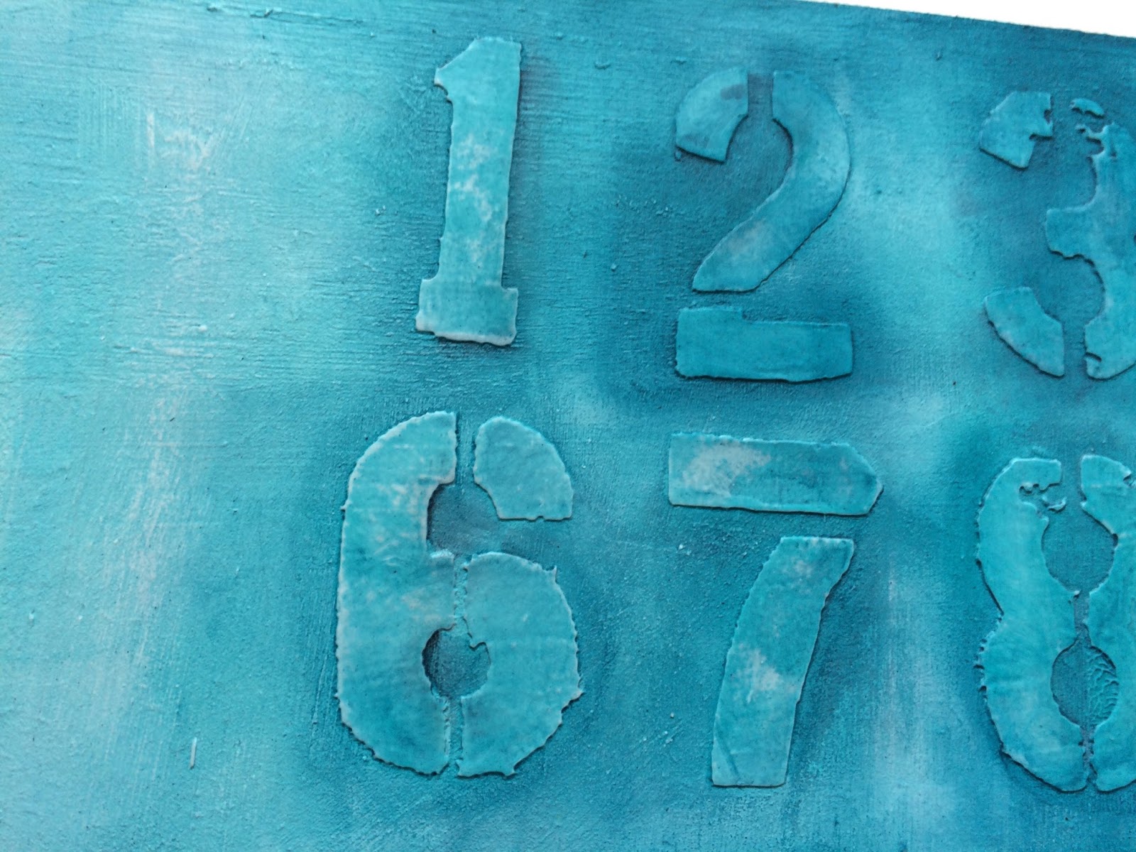
Next I painted the whole thing with PaperArtsy Freso Finish paints. I used 'Mermaid' 'Beach Hut' and 'Inky Pool'. The 'Inky pool' is the darkest and I used that to accentuate the numbers by painting it on and then wiping some of it off again. 


Here's a close up. 


Next I used some Tim Holtz stamps to add some interest. The harlequins were stamped with a white ink which faded whilst drying so I poured some white embossing powder over them just before it was dry and heat embossed it. In the final version you can see that they are a lot whiter. 


Next I used a flower die to cut some flowers from a piece of white cotton. I cut loads of them... 


Here they all are, ready to be coloured... 


I used Dylusions spray for this... 
After cutting I sprayed them with the Dylusions inks that are in the photo; I did think they were way to bright though, so I sprayed them with the White Linen spray and that toned everything down a bit. 
After drying with the heat tool, I put them together with a brad. 


This is what they looked like.... 


Next I took a scrap of white card stock and used a Copic Marker to draw some horizontal linen on it. I then cut them into vertical 'stems' for the flowers. 
The flowers and stems were then adhered to the panel. 


Here's a close up of the flowers.... 


The last thing I did was stamp the sentiment with Tim Holtz "worn text" alphabet stamps, cut out the words and adhered the strips onto the panel. I added some shading with a charcoal pencil... 

That was it... 


Hope you will join us ! 

I am also entering this into the take it make challenge over at Craftstamper ! Wish me luck !!!